Offer Clients A Smoother, More Intuitive Experience with Showcase 3.0
At Matterport, we are committed to providing our end-users with the best, most immersive experience possible.
In 2015, we released the second version of Matterport Showcase that came with a Highlight Reel and Guided Tour. In the following years, more and more features were added to Showcase, but little had changed in terms of the user experience.
When we decided to update Showcase in 2017, we took the opportunity to re-evaluate and to create a holistic design that would better serve both the current and the foreseeable future needs of our users.
What you see today is phase one of the entire redesign.
Matterport Showcase Gets a Facelift
One of our goals was to reduce the visual-clutter in Showcase so that users can explore the space without any obstacles.
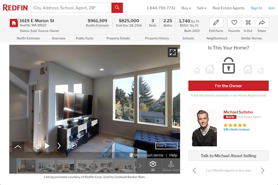
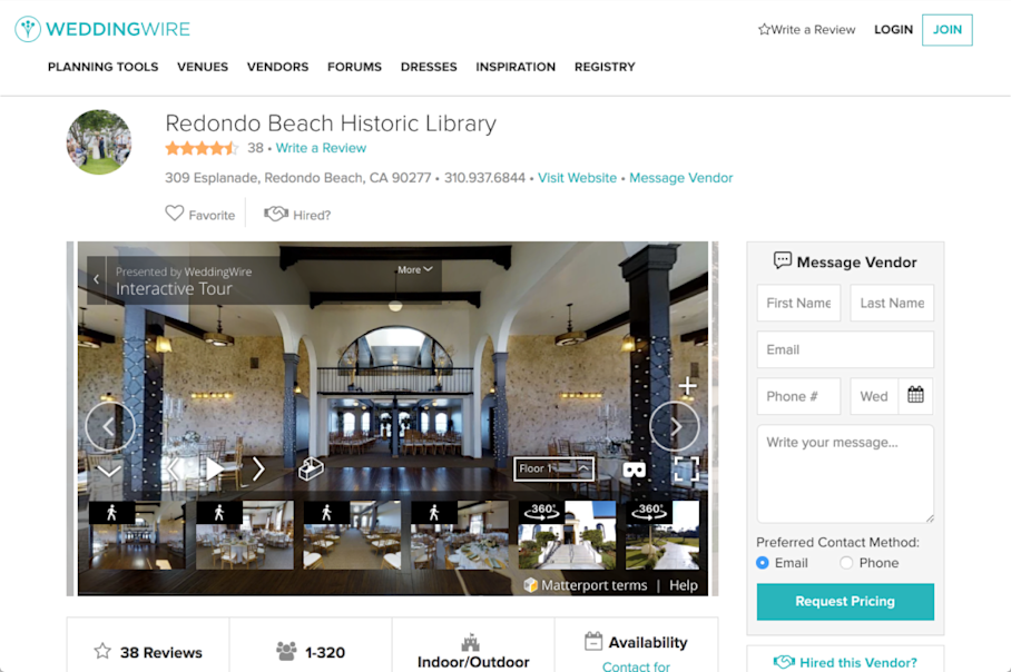
Most of our users embed Showcase in their websites today. The embed sizes vary from site to site. As a result, the sizes of the user interface (UI) elements (such as icons and panels) matter. They should proportionally look right in context of the parent site (the site that embeds the Showcase Player.)
How Showcase 2.0 displayed when embedded in Redfin and Wedding Wire.
/td>
For Showcase 3.0, we have reduced the icon sizes for desktop because generally our mouse cursor is precise enough to select a small target. We prototyped and iterated our concepts and tested them on different embed sizes to make sure the primary controls are targetable. We also identified unnecessary pixels in other UI elements and tightened them up.
Tracy Cui, the newest addition to our design team, also finessed and refreshed the iconography so they look more consistent, crisp and modern. The icons now look like coming from the same family.
Finding the Right Balance in Simplicity
In architecting our redesign, we gave a great deal of thought to the priority and interaction of all the UI controls. One of the difficult decisions we had to make was to decide which controls to keep and which ones to drop. Is removing the control the only way? What if there’s another alternative? This became a great opportunity to push our creative thinking further.
Creativity doesn’t live only within the design team. In fact, one of the design breakthroughs came from our front-end engineer, Miranda Huey.
One important piece of information needed for the Guided Tour is the ability to tell its progress. One day I was struggling to design a non-cluttering way to tackle that piece of information. Miranda saw my designs and asked, “How about a mini-progress bar?” What a great inspiration! We quickly prototyped the interaction and showed it around, and those who saw it loved the simplicity of the solution!
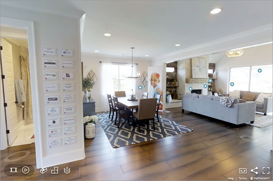
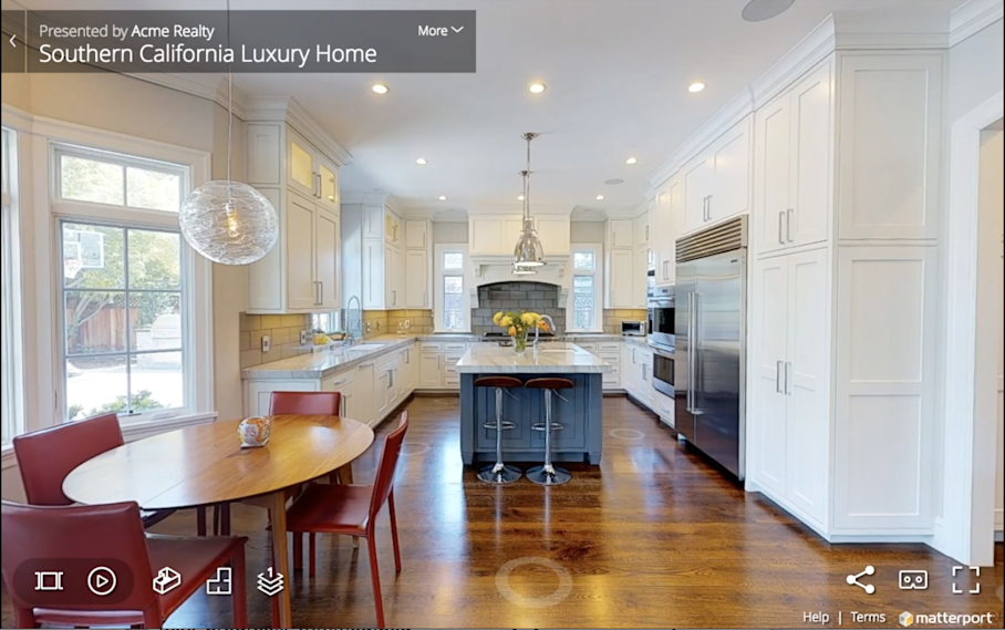
The new Showcase 3.0.
It has been a great joy working on the redesign of Matterport Showcase and seeing certain design ideas come to life. We have more exciting improvements coming in 2018 and look forward to sharing it with the world soon.
To learn more about how you can view your Matterport Spaces with Showcase 3.0, read our community post here.